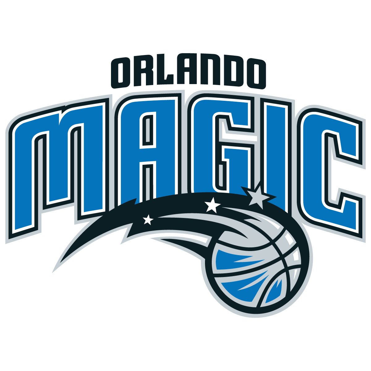
The High-Res JPG: When, Why, and Where to Use It
This state-of-the-art asset is delivered as a premium JPG with a solid white background. While vector architecture handles final stadium production scales, this flat raster structure serves critical, high-speed functions within your design suite:
When to Use It (Editorial Web Frameworks): This flat graphic is prepped flawlessly for standard white user interfaces. Place it directly into sports blog cards, digital news thumbnails, and automated league standings grids where a solid background keeps the outer boundaries perfectly intact.
Where to Use It (Rapid Mood Boards & Wireframing): Implement this format inside fast wireframes within Adobe Photoshop or Figma. The flattened asset locks the vibrant Magic Blue and updated Pure Silver into a single flat canvas layer, eliminating rendering lag during fast internal review cycles.
Why Choose JPG: It provides a lightweight, highly compressed asset that keeps your web platform operating at lightning-fast speeds (boosting SEO) while preserving razor-sharp edge lines on the updated, minimalist wordmark.
Official 2026 Orlando Magic Color Palette
To preserve absolute brand accuracy and ensure that these newly calibrated cosmic tones do not shift across varying global digital displays, input these exact franchise hexadecimal and RGB specifications directly into your design software:
Magic Blue: Hex #0077C0 | RGB (0, 119, 192)
Magic Pure Silver: Hex #C4CED4 | RGB (196, 206, 212)
Magic Core Black: Hex #000000 | RGB (0, 0, 0)
Pure White: Hex #FFFFFF | RGB (255, 255, 255)
Pro Art Direction Tips for Modern Minimalist Marks
Because the 2026 Orlando Magic logo masterfully relies on clean lines and flat colors to establish its premium posture, protecting the negative space around the asset is your primary task.
When embedding this JPG into your custom digital graphics, respect the newly achieved minimalist order. Avoid choking the logo with aggressive external drop shadows, vintage grunge filters, or chaotic background stadium photos that will bleed into the sharp perimeter of the star-ball. Instead, let the mark breathe by surrounding it with extensive white negative space or locking it down against solid blocks of matte charcoal or deep electric blue. When creating supporting graphic elements, echo the improved wordmark by selecting clean, high-end geometric sans-serif typefaces to complement the youthful, modern architectural structure of the 2026 rebrand.