Orlando Magic Logos
Designing with the 2026 Orlando Magic Primary Logo: Minimalist Flight and the Corporate Roundel Debate
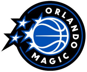
In June 2026, the Orlando Magic officially debuted an overhauled primary logo and visual identity system, aggressively stepping into the modern era of sports branding. The franchise completely stripped away the cluttered structural layers of the past two decades, opting for a streamlined look that honors the team’s cosmic heritage while optimizing their asset performance for high-density mobile viewports and contemporary digital merchandise. Read More –>
An Expert Design Critique: Escaping the CPG Aesthetic and the Question of Circular Monotony
The 2026 Orlando Magic rebrand represents a massive victory for digital typography and layout balance. In my professional opinion, the newly updated wordmark is significantly more legible and successfully aligns Orlando with the broader minimalist evolution taking over the NBA.
For years, the Magic were trapped in a loud, heavily structural layout—characterized by overly dramatic, bloated box lettering bursting with multiple outlines, severe gradients, and forced 3D velocity streaks. This was a classic manifestation of the CPG Aesthetic (Consumer Packaged Goods), making the team mark look more like a grocery-store energy drink or a cleaning product than an elite basketball organization. By abandoning those ostentatious box characters and embracing a refined, flat typography system, the 2026 logo brings absolute clarity back to the word Magic. The iconic silver trailing star-ball remains, but it now cuts through the composition with sleek, vector efficiency rather than 90s clutter.
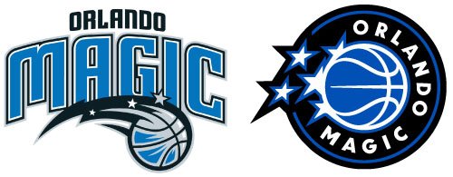
However, observing these league-wide transformations raises a vital structural question for the design community. With Orlando’s latest update leaning into a balanced geometric framing, we see yet another franchise adopting a variation of the clean circular stamp.
The Roundel Epidemic: Cross-Franchise Influence or Digital Necessity?
Looking closely at the current landscape of NBA rebrands, one must wonder: is this widespread adoption of the roundel emblem a symptom of a total lack of originality, or is it a severe case of cross-franchise design influence?

While geometric circles offer flawless adaptability across social media avatars, mobile apps, and corporate patches, the industry runs a dangerous risk of creating a monotonous corporate monoculture, where the unique, magical grit of individual team histories gets smoothed away by the exact same boardroom compass.
Showing all 3 results